Ian Ph. UX designer

Here!
Me

Bookmarks

Playground

Writing
Project

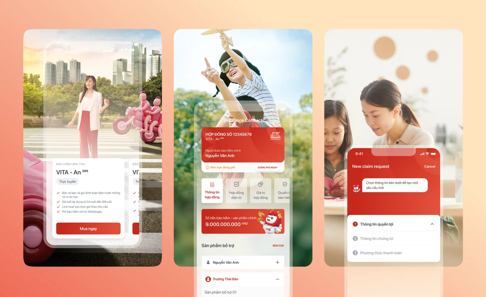
GenVita - Generali

Capella GenAI

UOB AI-Pitch

Trading Agent AI

OSL Trading

TCB Design system

Omanadala
Online

ian.ph693@gmail.com
Creating a Paradigm Shift by
connecting Insurance & Lifestyle
Generali Vietnam

01/ Overview
/ Client
Generali
/ Duration
6 months – 2021
/ My Role
UX-UI designer
/ Tool
Figma
/ Context
This case study shows how I balance innovation and practicality within traditional insurance systems during the COVID-19 pandemic. Explore the tools and processes that make this possible through daily health monitoring and recommendations.
/ Client Brief
Generali aspires to create a paradigm shift within the insurance sector, radically changing perceptions and expanding its reach globally.
We teamed up with the brand to complete two missions within a short timeframe: a deep-dive into why a super-app must exist to meet its objectives, and localising the experience while maintaining consistency and safeguarding Generali’s global branding.
02/ Role
Beyond Design Consultant
Let's jam and co-create
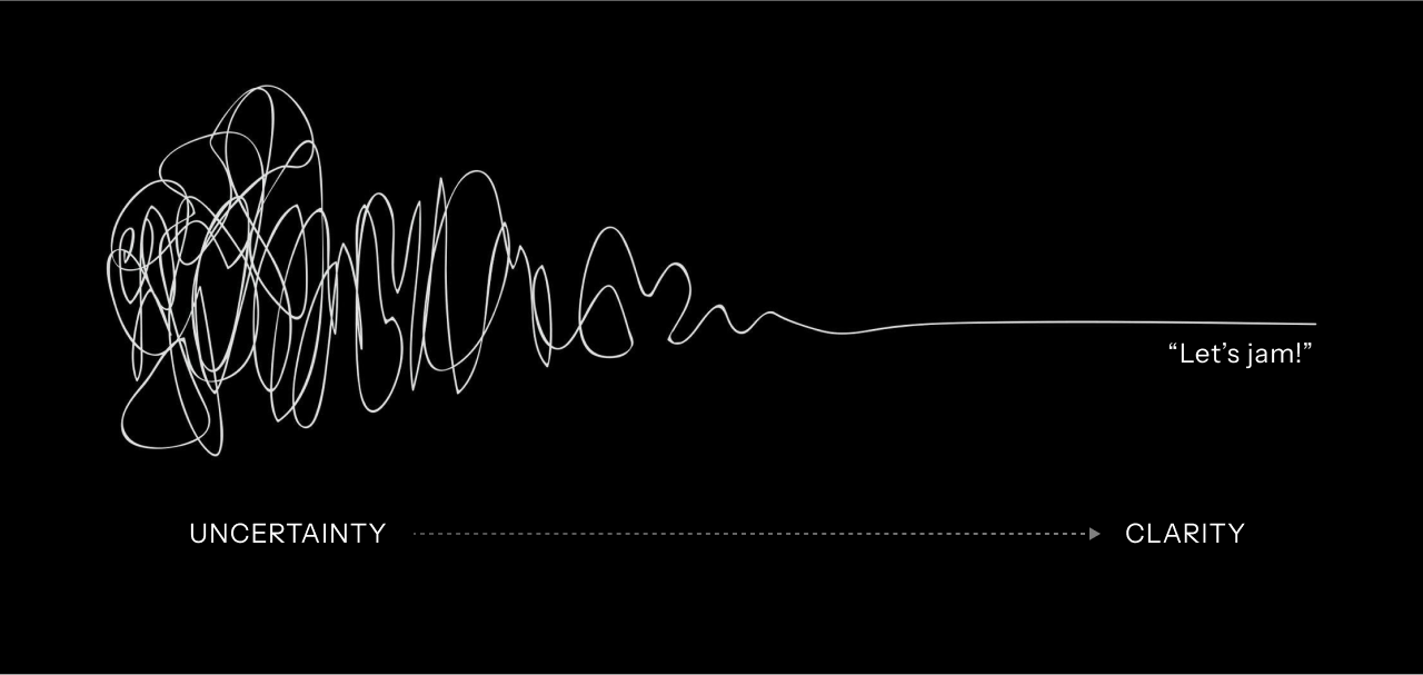
The squiggle is a simple illustration of our co-creation process.
And “Let’s Jam!” is no stranger to to our team. Grab your fellow and let’s jam.
03/ Key Challenges
From challenge to solution
Leverage legacy value
/ Challenge
The information system has been collected for a long time, it is not possible to throw it all away and remake it as a new product. The stakeholders of the insurance company cannot understand much about the digital product expertise.
/ Solution
Instead of just looking for stakeholders as a habit, we builded relationships through "Let's Jam" to together understand the real needs and real pain points for both users and stakeholders, in order to create suitable solutions.
Stakeholder Management Principles
Do your homework: Invest time upfront to prepare and align with stakeholders. It speeds up sign-off down the line.
Waste no time: Streamline meetings by trimming unnecessary participants and appointing a coordinator to keep things on track.
Show, don't tell: Support design decisions with data & user research. Real-world examples or case studies can make a big difference.
Build relationships: Get to know key decision-makers and don't hesitate to lean on them to help resolve disputes.
04/ Process
From challenge to solution
Challenges Spark Innovation
/ Challenge
Insurance is no longer strange to people, but knowing when to buy insurance and which insurance package to buy, especially investment insurance packages, still needs a lot of exploration.
/ Solution
Instead of focusing only on customers who have purchased, we want the product to be useful for all users, helping them monitor their health and financial situation, and from there, giving appropriate suggestions.

Process overview
Kickoff

Brief
Discovery
UX researchUsers interview
Strategy
Lo-fi solution
Design sprint
UX design
UI design
User testing
Closing
Presetting
Final decision
Production
Support
05/ Design discovery
The current Genvita flow has multiple usability issues, does not cater to inexperienced of both new user and exists customers , and the UI design is outdated across all platforms and devices.
/ Stakeholder interview
I understand this application is not just about the end users, I need to listen and help stakeholder too. To kick start the research process, we conducted Stakeholder Interviews.
Main objectives
Understanding the vision and expectations of our stakeholders for the brand new
Understand the current challenges and opportunities of the GenVita app that we should dig deeper on in the research process
/ Challenge
Basic app. There is not a lot of things users can do other than simple activities.
- Overwhelming structure of content. It was mentioned that the app does not have an intuitive structure to its content.
- Unconsolidated accounts. Lacking linkage of multiple accounts, giving difficulties for users to manage multiple accounts, which also affects Generali’s way of managing these accounts.
- Lacking “Forgot Username” journey. For those that do not remember their account details, there is not way for them to link to Zalo or Google to recover their account.
Several usability issues that can be tackled through this revamp:
- The application limits the time in payment and information editing from 7AM to 8PM
- Insurance information editing is buggy which leads to the system not updating the changes. The system didn’t update the details which have been changed from customers.
- OTP capabilities are inconsistent. The messages code in slow, and is lacking auto-populate features.
- System freezes when users make a payment.
- Upload file feature is buggy – does not process files that stated to be suitable.
/ Opportunities
- Tackling current issues. Ensuring we solve the pain points and challenges, and providing a seamless experience in managing accounts.
- Easy onboarding. A quick and easy onboarding experience to drive acquisition.
- Longevity design. Ensuring that our app is capable for future additions and development.
- Expanding to employee insurance. Users are not able to find any company insurance policy information on the app.
- Gifts module. The current gift section is basic (lacking features such as sort, filters, etc) and could be extended more into something more valuable.
- Extended telemedicine features. With the uprising trend of telemedicine, the current app lacks the capability to connect with a doctor through voice/video call
- Increase awareness. A tool to build brand identity and help attract potential customers.
- Lifestyle integration. Being a part of customers lives outside of insurance needs. Looking into health features to create habits within our users. Al assistants to remind users on certain actions on information.
- Understanding our customers. Through daily engagement, we can uncover distinct trends and behaviour shifts in our customer data. This could help us understand their needs
- Smart nudging. Providing a space to upsell/cross sell Generali products and services without being too intrusive.
- Seamless web and app experience. Ensuring experience is delivered consistently on web and mobile.
/ Landscape analysis
To innovate, we must first understand the current landscape of digital insurance locally and globally. To do that, can do this through a landscape analysis, where we can identify key gaps and opportunities that can leverage on between our digital products and the competitors’.
/Local competitions
PRU oline – Prudential Vietnam
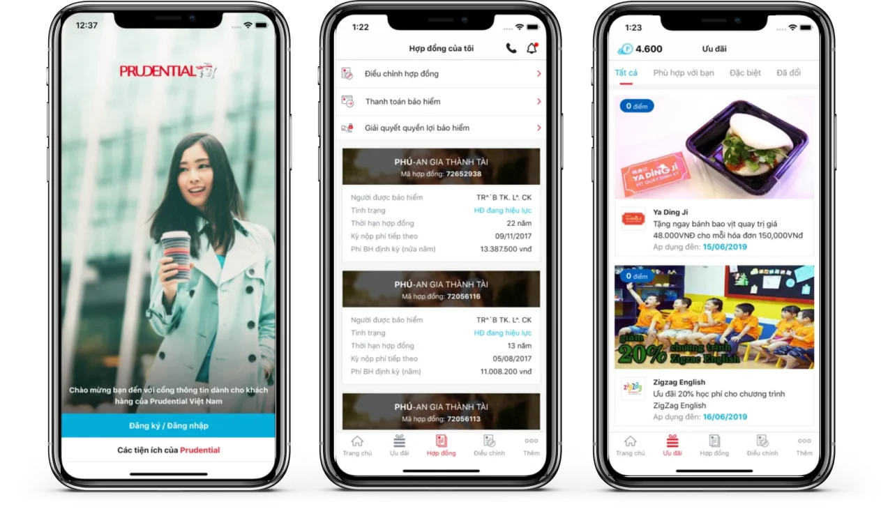
/ Opportunities
A well-executed loyalty/reward system could easily increase engagement on the app.
- Managing contract. Manage easily the status of your Life Insurance policy anytime, anywhere with simple clicks.
- Paying Insurance fee. Fast, secure online Premium Payments for one or more policies at the same time
- Rewards. Allows customers to register for PRUrewards app – this is the first Prudential Loyalty Program where customers are given the right to actively choose gifts and incentives.
- Modifying contract. Easily change contact information for one or more contracts at the same time.
- Claim process. Send quickly the insurance documents of claim case via this app
My AIA
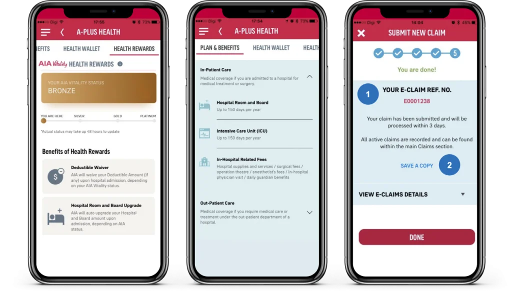
/ Opportunities
Connecting offline and online experiences, and encourage users to live a healthy lifestyle by integrating challenges that rewards them if accomplished. Telemedicine and online diagnosis features could also be an opportunity for us.
- AIA Vitality. By Personalising and tracking your exercising plan. Set weekly and daily goals and earn rewards for the healthy habits.
- Financial Health Check. Search the sufficiency of customer’s protection coverage by taking an assessment.
- Tele-Medicine. Chat with a doctor online, check symptom, medication deliver, list authorised doctor.
- Manage Your Medical Benefits. Cashless medical care, pre-register visit, push notification, update on insurance and medical claim online.
FWD
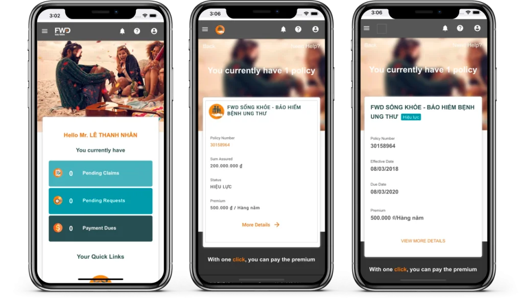
/ Opportunities
Ensuring that we provide a complete and seamless experience around the “hygiene” features of the app.
- Access to insurance policies 24/7. Users can access their policy information, or other policies right from their fingertips.
- File benefit claim online. Users are able to file claims on the app.
- Online premium payment & withdrawals. Users have the ability to manage their payments and withdrawals from the app.
- Usable at best. This app only covers “hygiene” features, and does not have any interesting lifestyle elements integrated to it. This could limit engagement levels within the app.
/Global Industry Standards
Ladder – term life insurance
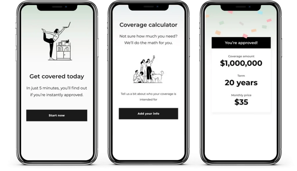
/ Opportunities
Providing users with appropriate insurance information will help educate them and aid them in making a more informed decision when purchasing a policy.
- Ladder promotes a streamlined experience, with policies sold and managed online without the use of agents, and instant coverage decisions that allow some customers to get insured minutes after applying.
- Ladder’s platform is cleanly designed (web and mobile), with an online quote process that gives you a quick cost estimate within a few clicks.
- These platforms also offer a guide to life insurance basics as well as a calculator to help you figure out how much coverage you need.
Lemonade insurance
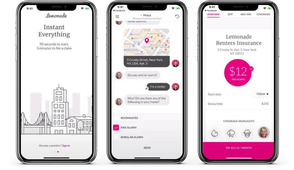
/ Opportunities
A quick and easy onboarding process can reduce drop off rates and potentially increase acquisition.
- Simplified, easy application process. Users can get a personalised policy within 90 seconds, after finishing a minor questionnaire about their personal details with an AI powered chatbot.
- Flexible coverage. Users can customise and adjust their coverage according to their preferences, giving them control of their finances. Coverages also include renters and pet insurance.
- Instant digital settlement. Claim filing can be done entirely through the app, form-free. Users only need to send a list of their claimable goods with a video detailing the incident.
- Lemonade encourages social responsibility by donating any remaining funds after claims to customers’ favourite charities.
/One stop platform
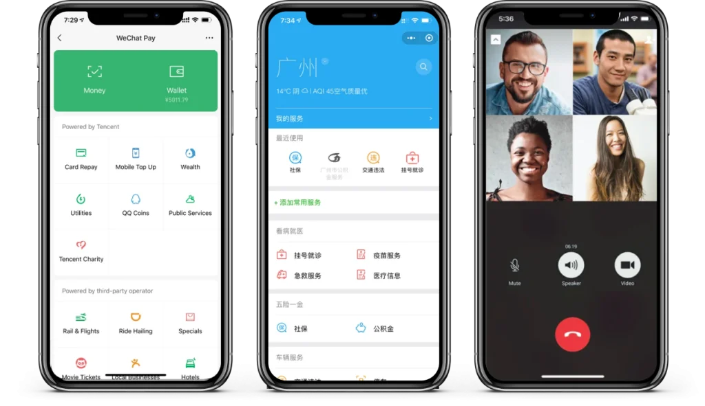
- Multi-purpose app that incorporate messaging and social media features along with e-commerce, payment facilities (bank card linkage) and many more day-to-day services.
- Direct bank card linkage through WeChat Pay and e-wallet feature which permits the payment for various services within WeChat.
- Small applications within WeChat called Mini Programs that offer myriad services from purchasing goods to matchmaking.
- WeChat analytic platform to study about the traffics of Mini Programs as well as Official Accounts.
- Offering wide range (health, auto, life and travel spaces) of user-centric insurance products through WeSure, a WeChat integrated insurance platform, which form partnership with insurance providers such as Taking, Pacific Insurance, PICC, Ping An, MetLife and more.
AliPay
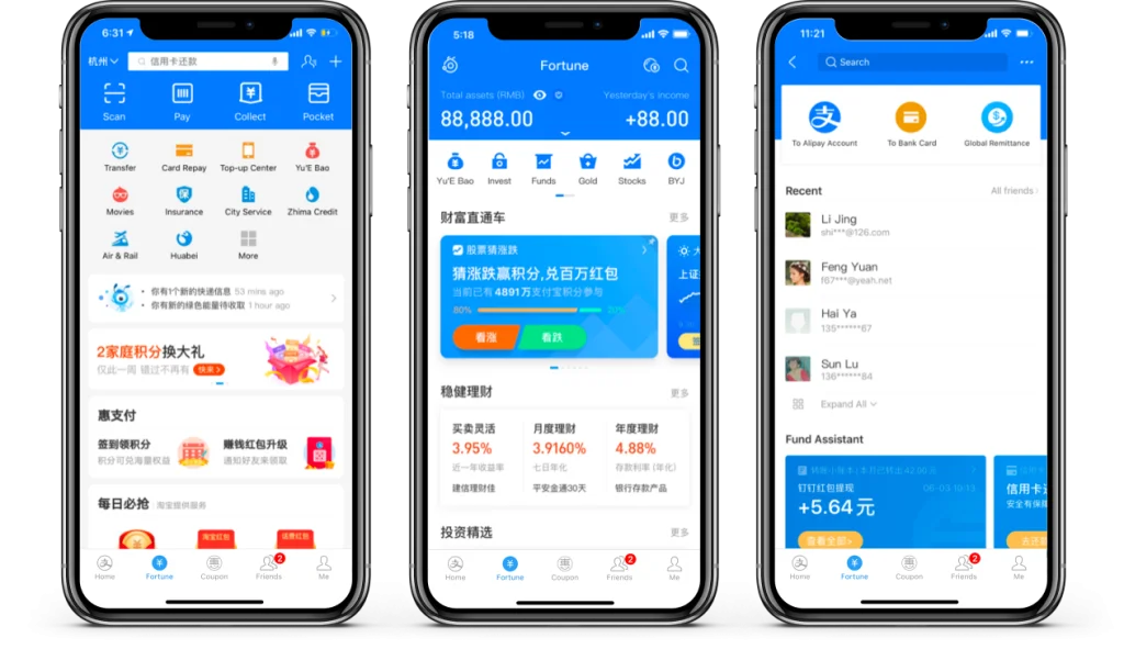
- A third party mobile and online payment platform that supports a plethora of services and features that touches every aspects of users lives.
- Bank card linkage and e-wallet feature for the payment of various services integrated within Alipay ecosystem.
- Mini applications or programs within Alipay ecosystem offers various services from purchasing goods to booking different types of transportation.
- Users can shop through the app’s integration with Taobao, the world biggest e-commerce site that facilitate C2C retail, and Tmall, a Chinese language website that support B2C online retail.
- Health, travel, automobile and financial insurance support are available through “An Insurance Services”, an in-app Alipay feature under the partnership with big insurers like Taking Life Insurance Co.,Ping An Insurance and more.
/ User research
I further dove deeper to understand more about our users through desk research and user interviews.
Main objectives
- Understand users perceptions and preferences when it comes to insurance.
- Understand how customers currently experience the GenVita application.
- Uncover opportunities for the GenVita application revamp.
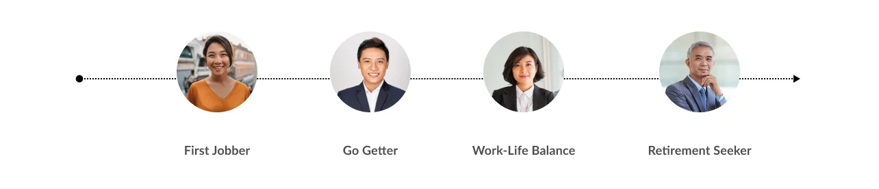
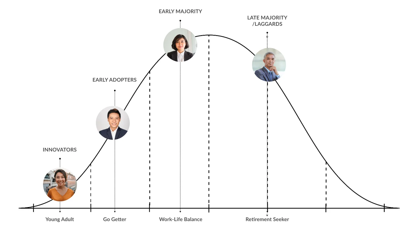
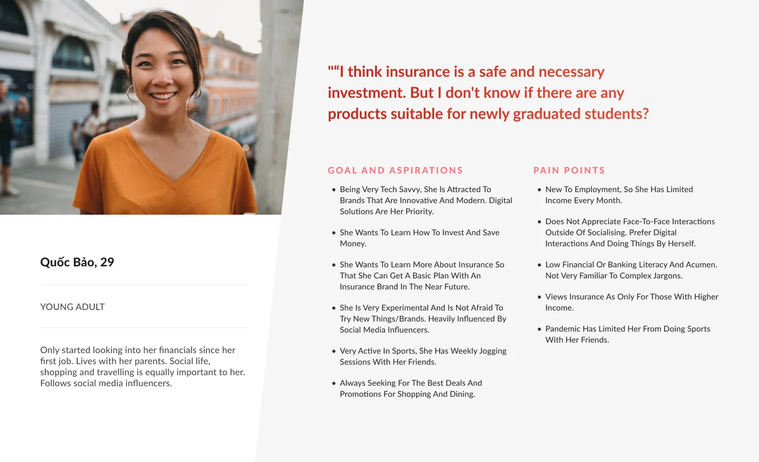
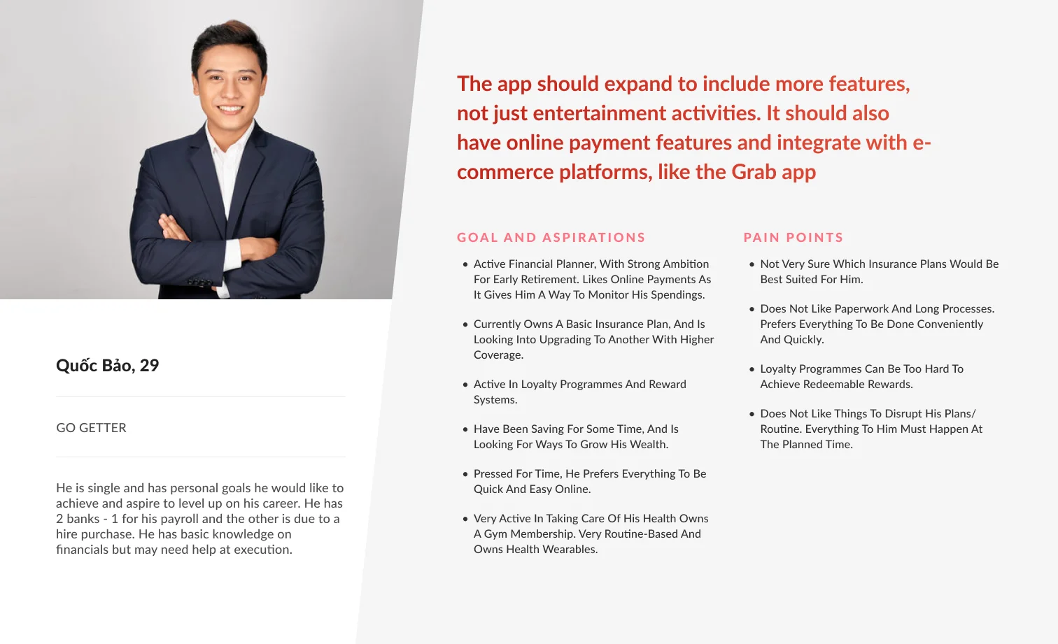
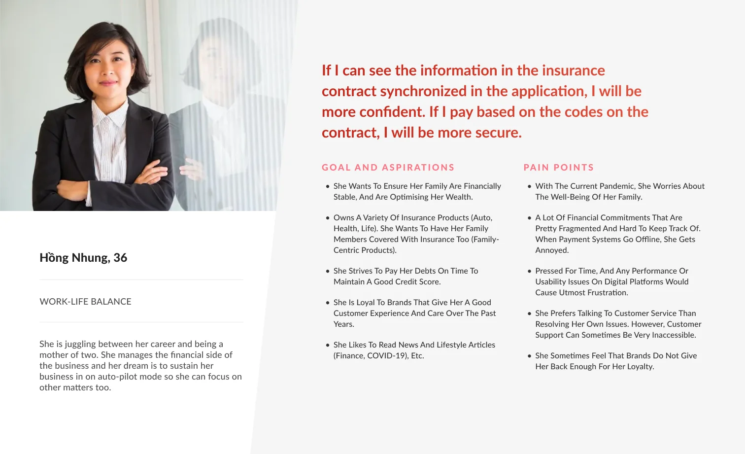
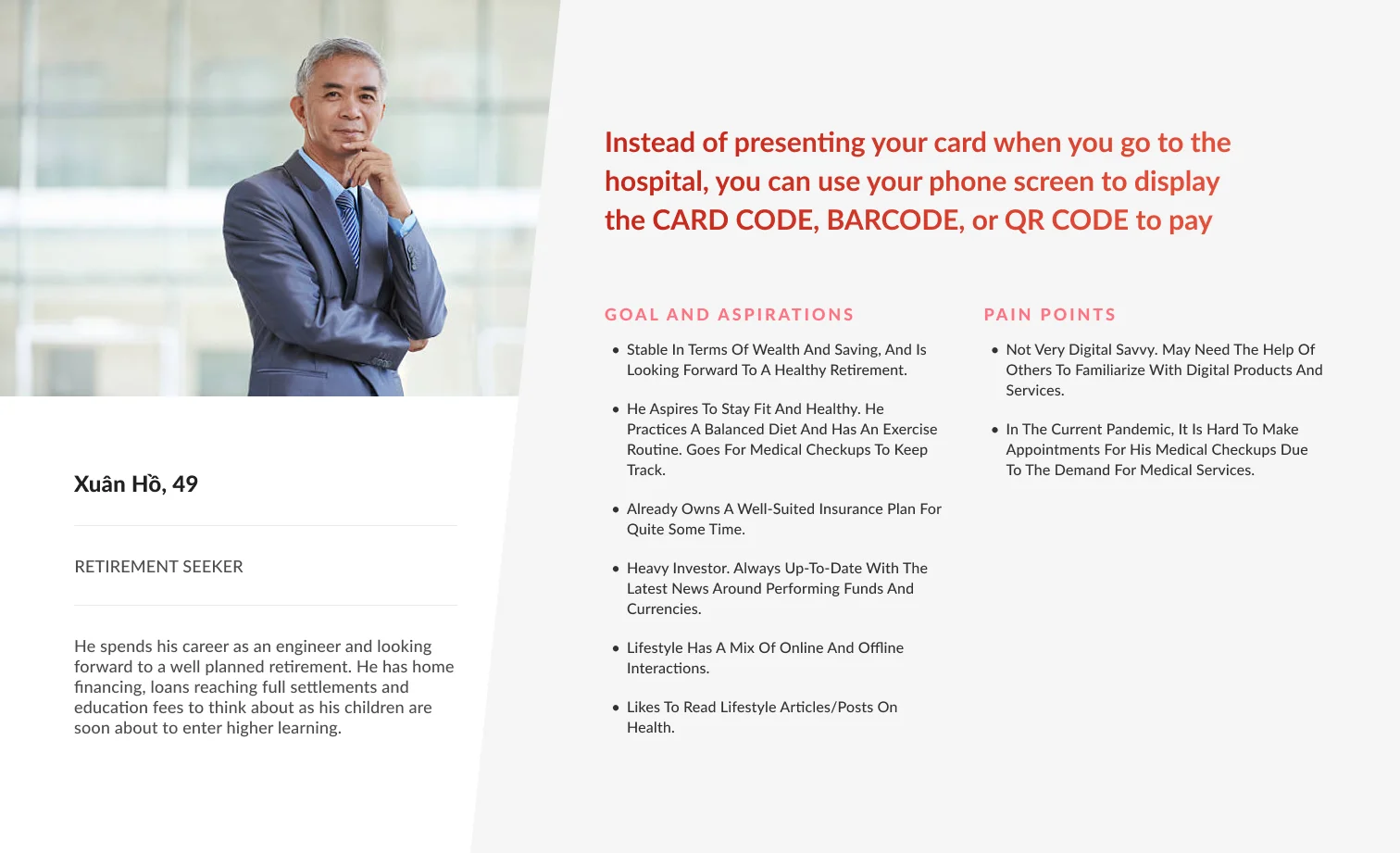
User personas
Based on our desk research, stakeholder interviews and user interviews, we formulated the following user persona framework to help shape our approach to the product’s features.
This framework is widely used in product development across industries, and is best suited for financial companies as their user’s needs would evolve as they go through different phases in life.
Mapping our personas against the adoption curve, we can easily grasp the tech savviness levels of our user personas.
Design Principles
Based on our landscape review, stakeholder interviews, user interviews and brainstorming workshops, I formulated the following principles to help shape our approach to design during the project.
/Conversational Tone
Ensuring that our UI and tone is conversational and layman to better cater to not just sophisticated users, but also users that are new to insurance. This could help us expand our reach to the younger audience.
/Creating Habits
Implementing habitual features that could drive daily engagement. This ranges from rewarding users for completing a task on the app, to providing basic and complex needs such as insurance and non-insurance.
/Accessible Guidance
Ensuring that our users are able to seek for guidance and support at any stage of their engagement. This can be done by making customer support more accessible, including educational materials to increase literacy, and also providing a digital assistant that can guide users without the need of an agent.
/ Starting the Design
Applying UX Laws – I reviewed the foundational UX laws – a series of best practices for building user interfaces. Using psychology in design helped shed light on user expectations, improving the overall user experience.

/Fitt’s Law
Large buttons placed in the thumb zone ensure users can quickly, easily and accurately access major functions

/Hick’s Law
Highlight compulsory fields to avoid overwhelming users, and place optional fields in separate location

/Jakob’s Law
Use familiar UI patterns for input fields such as dropdowns, error states, etc to leverage existing mental models

/Zeigarnik Effect
Stepper bars at the top provide a clear indication of progress to motivate users to complete tasks
/ Design concepts
We brought our vision to life with three lo-fi design concepts, each offering a unique way to help users engage with their finances.
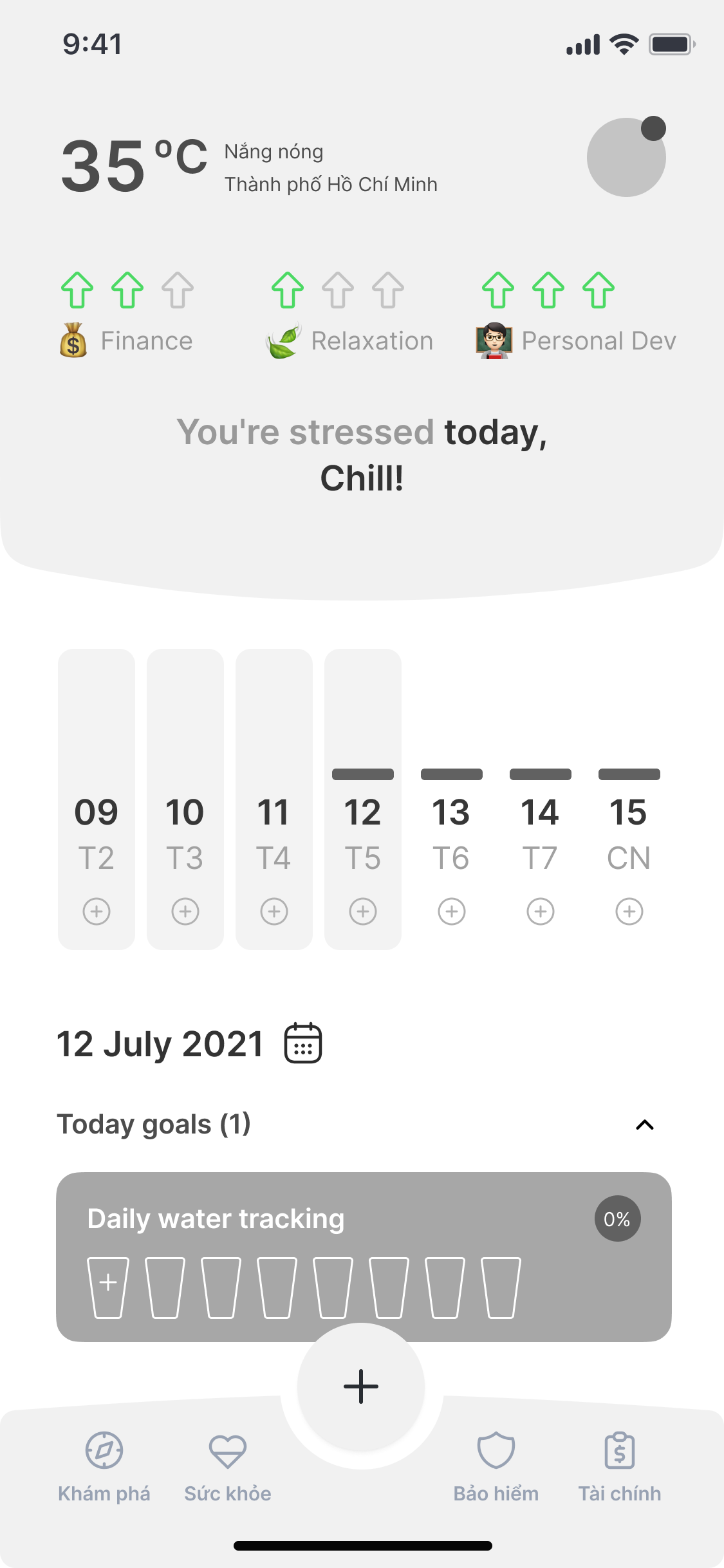
Daily Check-in - Build Better Habits
/ Purpose
Encourage users to return daily and develop healthy routines by tracking their personal well-being and financial status in one simple flow.
/ Feature Overview
- Users receive gentle daily reminders to check in on key aspects of their health and financial activity.
- Data is visualized through a weekly calendar, offering a clear view of consistency and progress over time.
- The app automatically generates personalized tasks based on the user’s habits and past behavior.
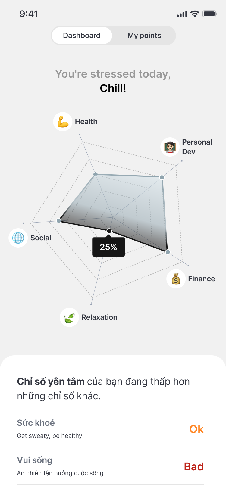
“What If…” – A Visual Snapshot of Your Well-being
/ Purpose
Transform scattered health, finance, personal dev data into one clear visual overview, helping users understand what’s going well—and what needs attention
/ Feature Overview
- As users regularly check in and track various aspects of their life, the app aggregates and maps this data onto a spider chart.
- This radar-style visual instantly highlights low-performing areas, offering users an easy way to self-reflect and spot imbalances.
- When a category scores significantly lower than others, the system proactively provides personalized suggestions—like small actions or daily habits—to help users rebalance.
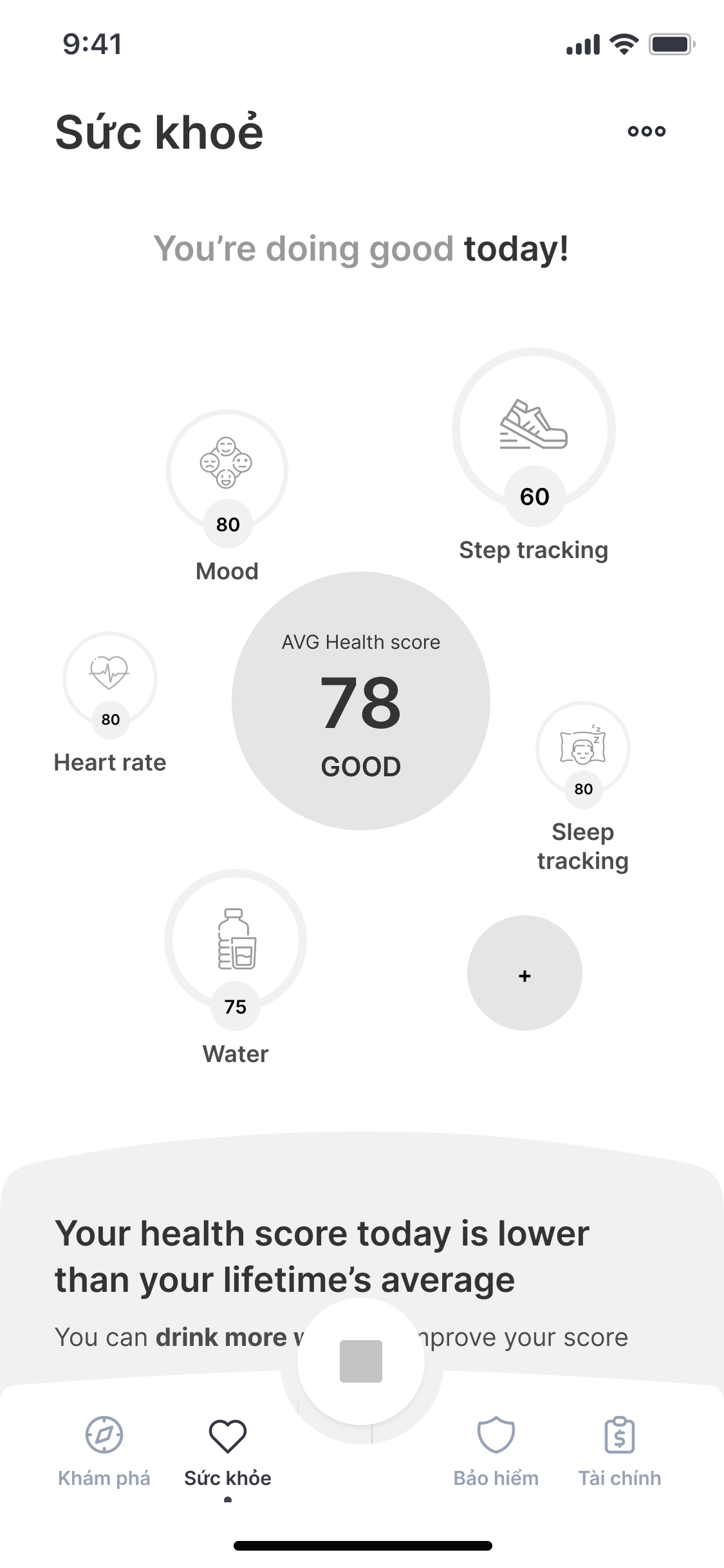
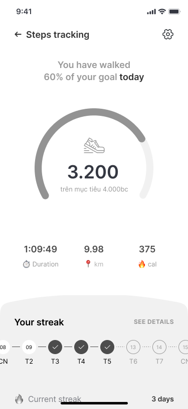
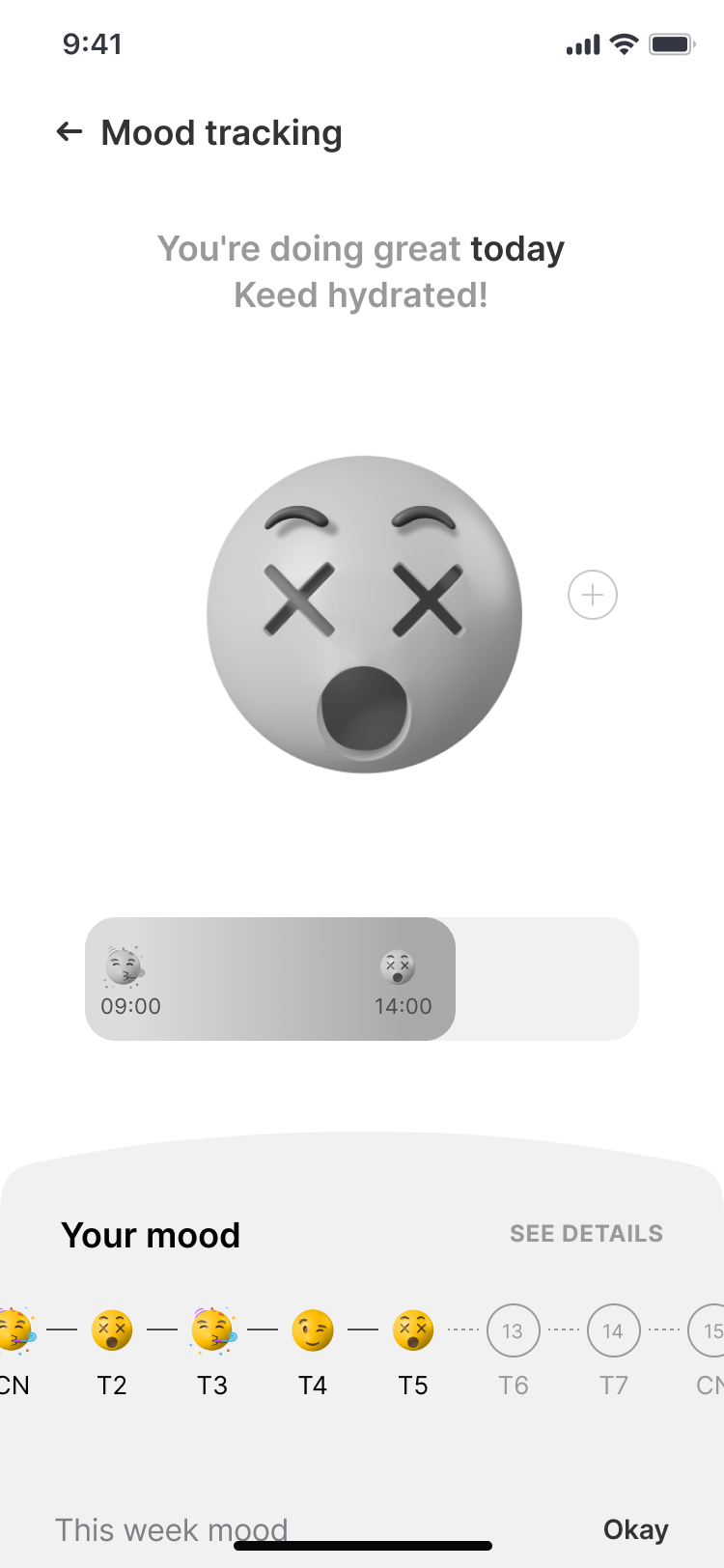
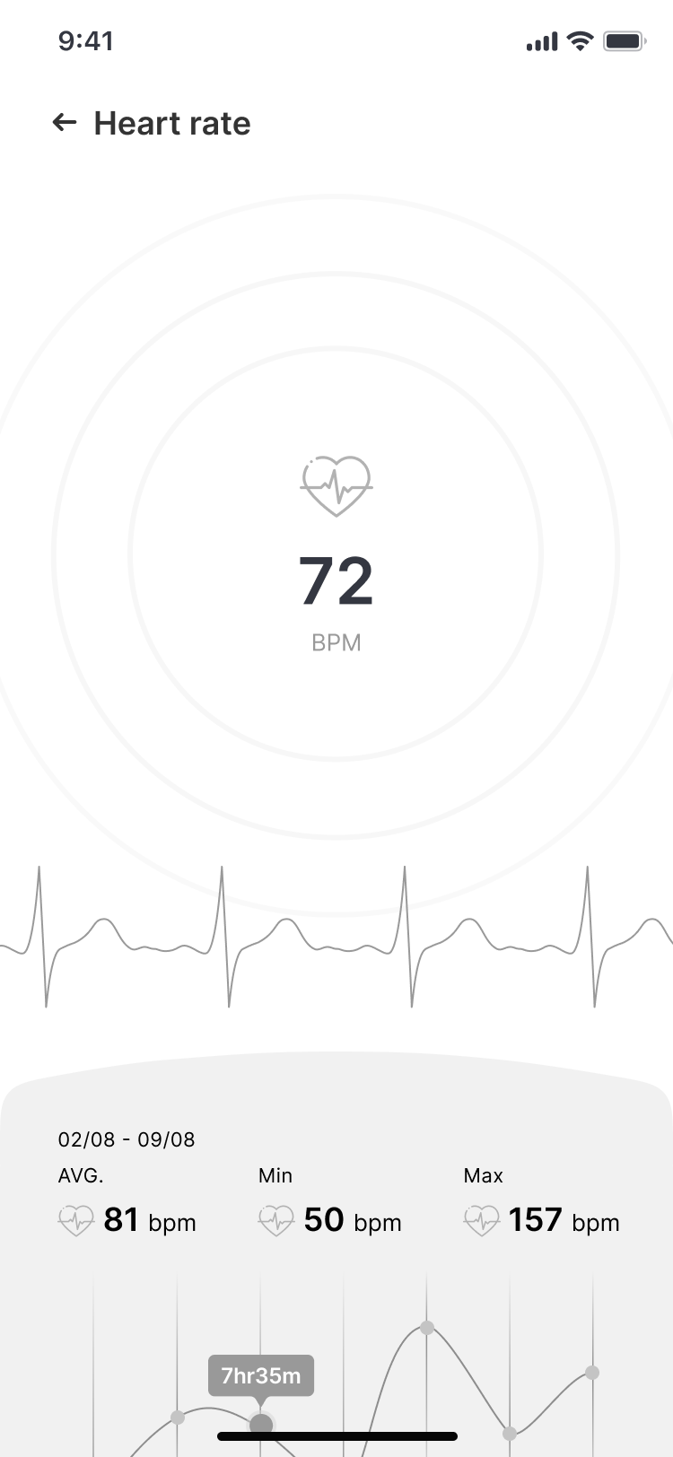
Health Tracking – 5 Pillars of Wellness
/ Purpose
Give users a structured yet flexible way to monitor their overall health through five key metrics—either manually or automatically via smart devices.
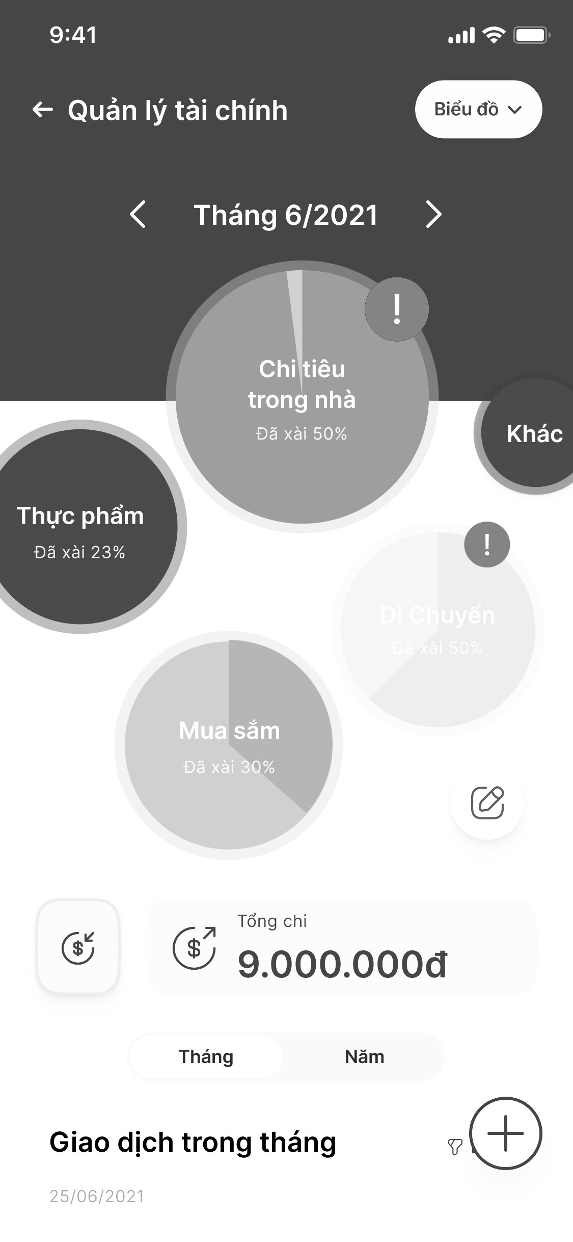
Smart Budgeting – Take Control of Your Monthly Spending
/ Purpose
Help users build better financial habits by tracking spending by category, setting personalized budgets, and gaining a clear monthly overview.
/ Feature Overview
- Users can categorize their expenses (e.g. Food, Transportation, Shopping, Bills) either manually or through smart syncing.
- For each category, they can set spending limits to stay on track and avoid over budgeting.
- The system provides a visual monthly breakdown of where their money goes—helping users spot overspending trends and areas for adjustment.
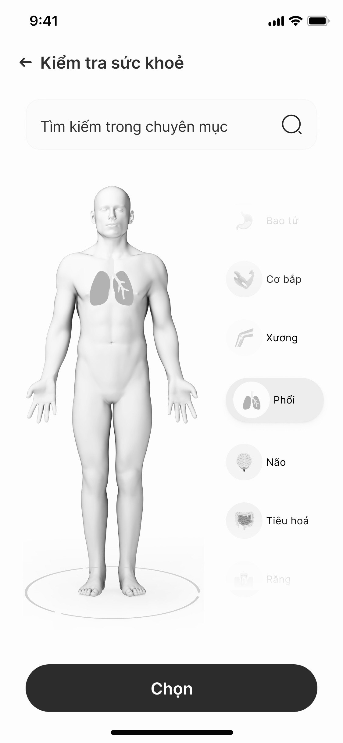
3D Body Map – Explore Health by Tapping Your Symptoms
/ Purpose
Empower users to better understand their body and common health issues through a 3D interactive model—making health information more visual, intuitive, and accessible.
/ Feature Overview
- Users can interact with a 3D human body model, tapping on specific areas to explore potential symptoms or conditions.
- Upon selecting a body part, the app displays contextual health content, such as common illnesses, warning signs, and self-care tips.
- The 3D design helps users navigate health concerns more naturally, especially when they may not know the exact medical term but can visually locate the area of discomfort.
/ New Business Potential Unlocked
/ Social Engagement Through Everyday Wellness
By encouraging users to reflect on and share their lifestyle patterns—like water intake, sleep, or spending habits—we created a non-intrusive, conversation-friendly entry point.
/ Cross-Selling with Contextual Relevance
The personalized dashboard and habit-tracking tools double as smart surfaces for promoting relevant products.
/ Encouraging Healthy Habits = Long-Term Value
By helping users stay consistent with healthier routines—whether financial or physical—we indirectly support the business’s bottom line.
- Healthier users = lower insurance claim risk.
- Smarter spending habits contribute to financial literacy and product adoption.
- Features like gamified streaks, milestone rewards, or health-linked goals drive app stickiness while fostering user trust and loyalty.
06/ Closing
/ Winning Moments
- Remote Discovery Sprint: Successfully facilitated a fully remote sprint process that kept the team aligned, engaged, and productive—despite the challenges of working from home.
- Behavioral Design Integration: Applied UX psychology principles to ground our design decisions in science, helping users build stronger, healthier financial habits.
- Balanced Exploration & Delivery: Used a clear UX prioritization framework to explore new ideas while staying grounded in MVP requirements—ensuring momentum without sacrificing creativity.
/ Lessons Learned
- Think Differently: By experimenting with UX anti-patterns and unconventional flows, we uncovered creative, user-centric solutions that traditional methods may have overlooked.
- Stakeholder Harmony Takes Work: Coordinating multiple stakeholders took time and effort—but was essential for maintaining alignment and project progress.
- Big Picture Thinking: Sometimes, the best decision is the hardest: we learned to let go of ideas we loved in service of the product’s larger vision.